THREE DISTINCT PRODUCT DIRECTIONS
A collection deserves
a point of view.
Same collection. Same tasks. Three different ways to search, inspect
and prepare a sale. Open each direction and try it on your phone, too.
01
 Explore direction ↗
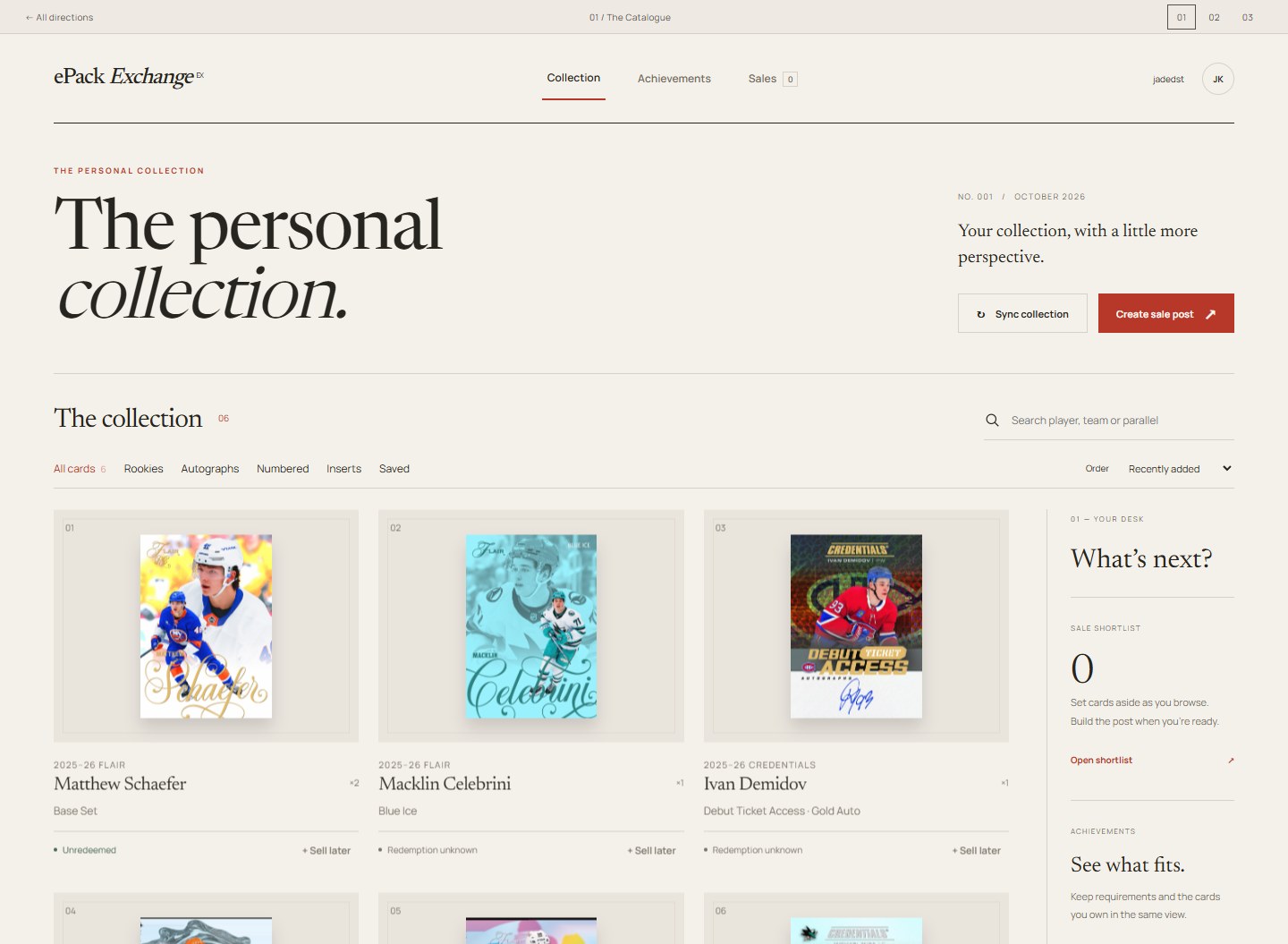
The Catalogue
A considered collector’s reference. Ivory, fine rules, warm ink and
a restrained vermilion. The card photography does the talking.
-
Feels likeA specialist auction catalogue
- NavigationTop-level, quiet and direct
-
Strongest atBrowsing & brand distinction
Open interactive mockup ↗
02
 Explore direction ↗
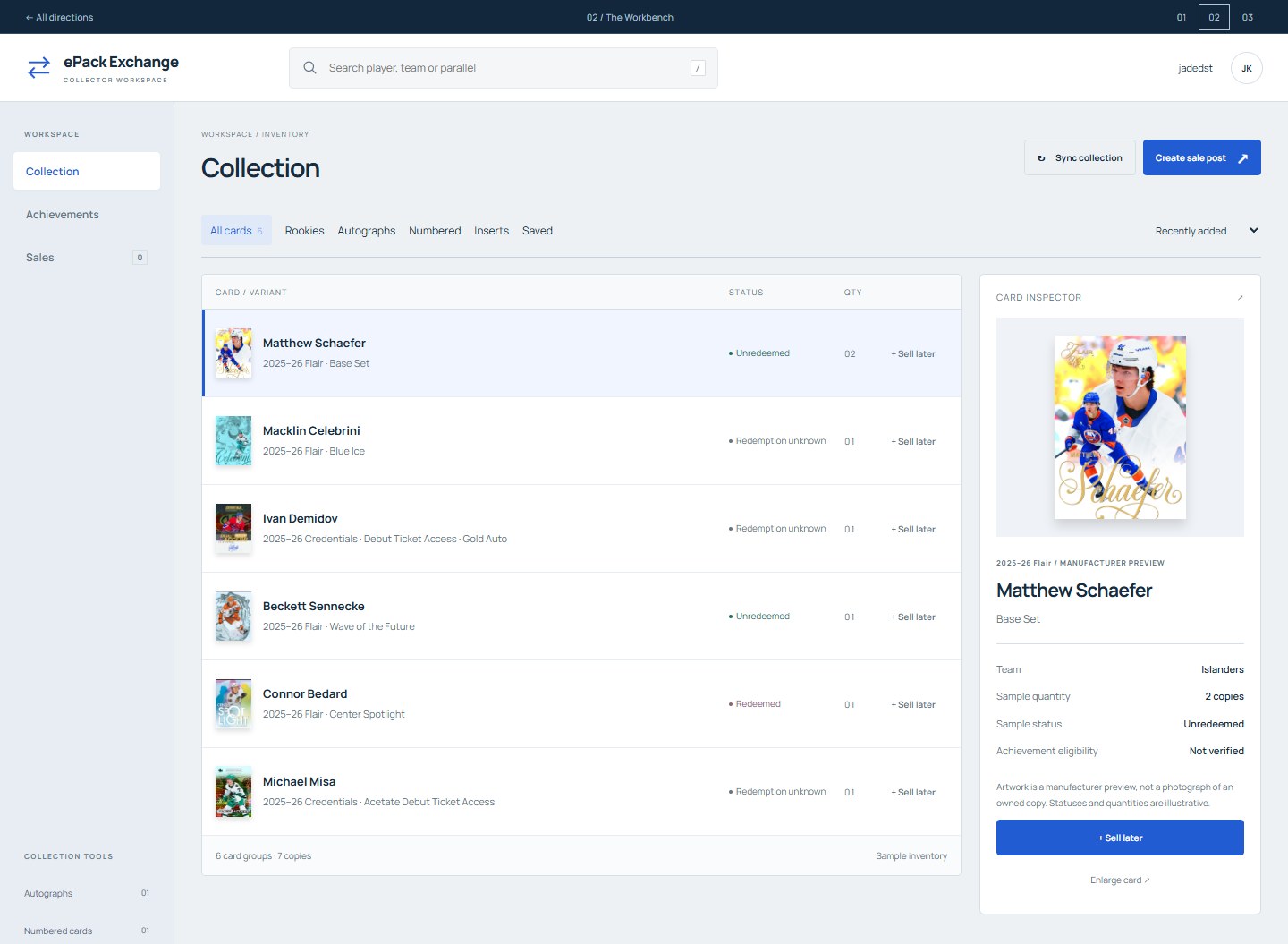
The Workbench
A collector’s working instrument. Compact rows, a stable inspector
and actions where you need them. Less ceremony between you and the
next task.
- Feels likeA professional editing tool
-
NavigationPersistent inventory & inspector
- Strongest atHigh-volume collection work
Open interactive mockup ↗
03
 Explore direction ↗
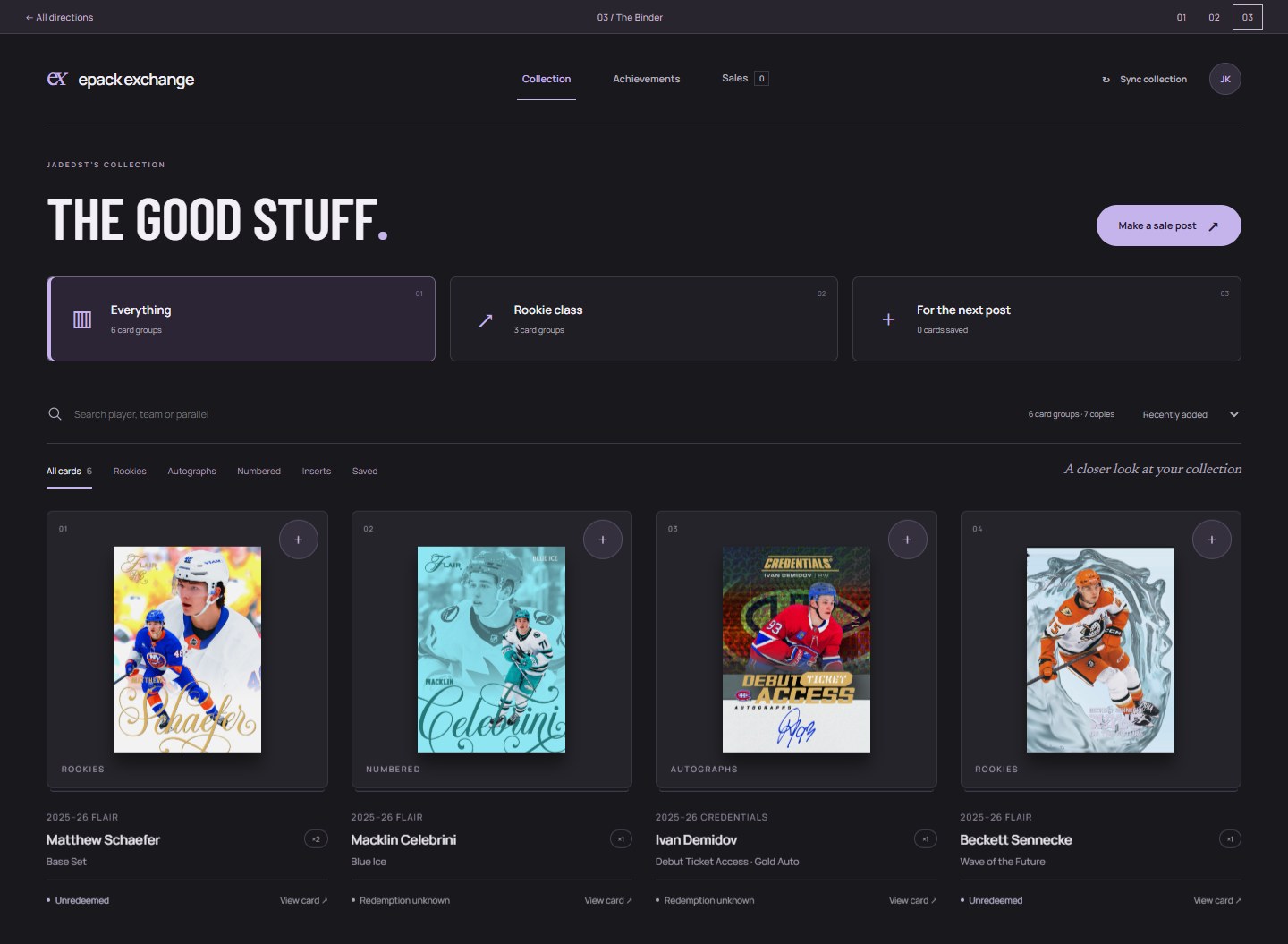
The Binder
An album you want to open. Graphite shelves, crisp display type and
soft lilac details. Built around the cards, with a mobile rhythm of
its own.
- Feels likeA modern record collection
-
NavigationAlbums & a mobile thumb dock
- Strongest atVisual collecting on mobile
Open interactive mockup ↗
Try the same tasks.
Search “Sharks.” Filter rookies. Open a card. Save two cards for sale,
open the sale studio and enter prices. All three mockups support those
interactions. These are local design studies using manufacturer
preview artwork and illustrative data; they do not change your
collection or publish anything.
Image and font sources.